Define Your Goals
Before you put pen to paper to write your sales copy for your website, be clear about your goals. We talked earlier about your goals for building a website—pull those out and look at them again. While you may be building the website to sell more cookies, as you start to look at the broader reach of your message, your goals might change. Perhaps you can put together gift baskets too.
Make sure the copy you are about to write targets those goals. And don’t forget to use all the keywords you just selected!
Sell the Benefits
Save the small talk for your next cocktail party. When it comes to filling websites with words, beginners tend to lean towards what I like to call the “cocktail party approach to website copy.” What do I mean by this? Well, let’s pretend you’re at a cocktail party, you’re huddled with a group of friends gabbing about everything under the sun, and around you hundreds of other conversations are mingling with your own, making the voices sound like a hum. That’s what it’s like to a website visitor when you cram a lot of cocktail party copy onto your home page. It’s confusing and it’s white noise. Chances are good that it will result in a “click” signaling the party’s end, your visitor long gone.
Instead, write copy that speaks to your readers and tells them the benefits of your product. Sell the sizzle not the steak.
Make it Scannable
Remember that Internet users scan websites and that relates to how you write good copy. When I spoke to Susan Gilbert, she told me about the elements of good copy. “The Internet has made ‘brochure-style’ writing obsolete. Studies have clearly shown that people do not read websites—they skim them. That means your copy must be written to be eye catching, visually compelling and keep the visitor on your site.”
How do you write scannable website copy? By incorporating lots of
- white space
- bullet points
- highlighted and bolded words
- images
Stay On Point
You should distill your web copy down to the most important points and eliminate everything else. You have less than a second to grab someone’s attention.
Don’t risk overwhelming your reader. Remember, it’s not about you, it’s about them.
Use Captivating Headlines
Be sure to make your message obvious. Use headlines, lists and bold text to convey your message. Spend some serious time really thinking about a catchy headline.
What Do I Get Out of the Deal?
When it comes to sales copy, the WIIFM (what’s in it for me) factor is more important than ever. I have already mentioned the importance of selling the benefits when writing good copy. Then I talked with Susan Gilbert and she emphasized this point: “People want to know what benefit they’ll receive from buying your product or service. Don’t be shy—tell them! Will they get free delivery? Will they make more money? Will they look better? Although visitors may want to know you, the person, sales copy is much more about telling them how their life will be better, safer, happier and richer once they’ve bought from you.” Hopefully between Susan and me we have hammered this point home.
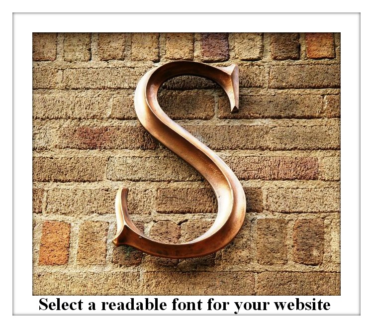
Picking the Perfect Font
When it comes to a font for your website, it’s easy to get carried away. Temptation might dictate that you use a fancy scroll or a really bold font. Wrong.
The challenge with using unique fonts is that the person at the other end might not be able to read it. When you land on a site that’s full of that horrible Courier font (my apologies to all you Courier lovers out there, this usually indicates that the site is using a font your computer can’t read.
Sometimes, when people want to use special fonts, they’ll turn them into graphics instead. But that’s good and bad. First, search engines can’t spider graphics (we’ll discuss the spider factor later). And second, it increases the load time of your website. The trick really is to pick a font (preferably a sans serif) that’s both readable and friendly to the eye, meaning that it doesn’t tire the eye the way a serif font does. So, what’s the difference between the two? When a web designer talks about a serif typeface, he means fonts like Times or Century Schoolbook, where the characters (letters) have little accents or curves. The small downward curves that appear at each end of the cross on the top and the inverted curves at the foot of the letter are known as serifs. “Sans” is French and literally means “without.”
Don’t Get Font-Happy
Do not overwhelm your site with a bunch of different fonts. It simply takes too much work for the reader to process the different letters and fonts. Nothing will send your visitors away faster.
*Excerpt from Red Hot Internet Publicity: An Insider’s Guide to Marketing Online by Penny Sansevieri, available now on Amazon.com
1 comment:
This is a great write-up. I am so glad that I came across it.
Sales Presentations
Post a Comment